

Rhea
Branding
My MFA classmates and I designed a series of smart home devices under one parent brand called RHEA.
I created all of the illustration and worked with Kat Brissette to develop the brand identity. The “smart” products consisted of a coffeemaker, oven, and door lock, and a central “Hub”.
TEAM:
Kat Brissette
Marisa Watanabe
Wenqing Liu
Claudia Dubé
COMPONENTS:
App Design
Branding
Illustration
INSTRUCTOR:
Abby Guido

Research
When brainstorming this project, we asked ourselves: Who was going to be our main audience, and what was their demographic? What was their age, occupation, and where did they live? From there, we came up with goals for our smart home devices. We wanted these items to offer comfort and safety, and also have a light-hearted and visually appealing brand. We surveyed 80+ people used that information in our user personas, which helped guide our design decisions.


Branding
While developing the look and feel of RHEA, we considered how COVID was impacting life at the time of this project (Fall 2020). Due to the stay-at-home-order, comfort was paramount. We wanted each touchpoint to bring joy, since they would interacting with the app every day. The goal was a friendly attitude with a slick sophistication. The typography and linear elements are calm and minimal, while the illustration is warm and tactile.

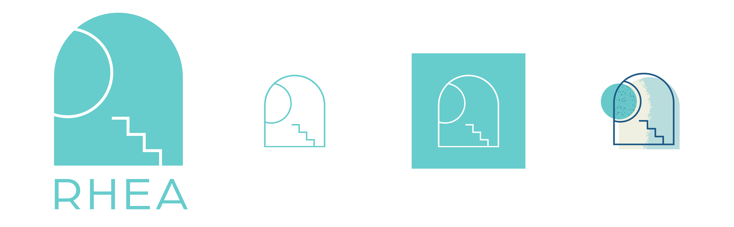
Name & Logo
“RHEA” stems from Greek Mythology: the goddess of comfort. It also shared the name of Saturn’s second-largest moon. Our logo subtly referenced a “window” shape and zig-zag steps (both elements in a home). The circle represented the view of the sun or moon – illustrating that RHEA will be there at all times of the day. The half circle and steps also form an abstraction of the letter R, for RHEA.

Illustration
For RHEA, illustration served more than a decorative purpose–it also helped users comprehend their experience clearly. The style used playful yet muted colors and textures to give it a tactile feel. We wanted to stray from the standard flat, vector-style illustration common in modern app design. By allowing evidence of the “hand” to shine through, the illustration became approachable and friendly. We wanted each scene to be specific, while leaving enough to interpretation so anyone could relate.


