What is 21.svg?
21.svg is the Tyler Graphic + Interactive Design's MFA class of 2021 graduate thesis show. It’s comprised of an online exhibition and social media campaign.
Although all of us worked in tandem on this project, my main focuses were developing the brand, and planning & executing the social media campaign.
TEAM:
Me :)
Kat Brissette
Wenqing Liu
Marisa Watanabe
COMPONENTS:
Branding
Social Media
Web Design
Online Exhibition
Concept
Name ⇒ 21.svg started out as an inside joke between us. We were all fans of Earth Wind and Fire’s “September” (🎶 do you remembah 🎶 the 21st night of Septembah 🎶), 21 Savage (in reference to our graduation year ‘21), and “.svg” was a reference to the file type acronym for Scalable Vector Graphics.
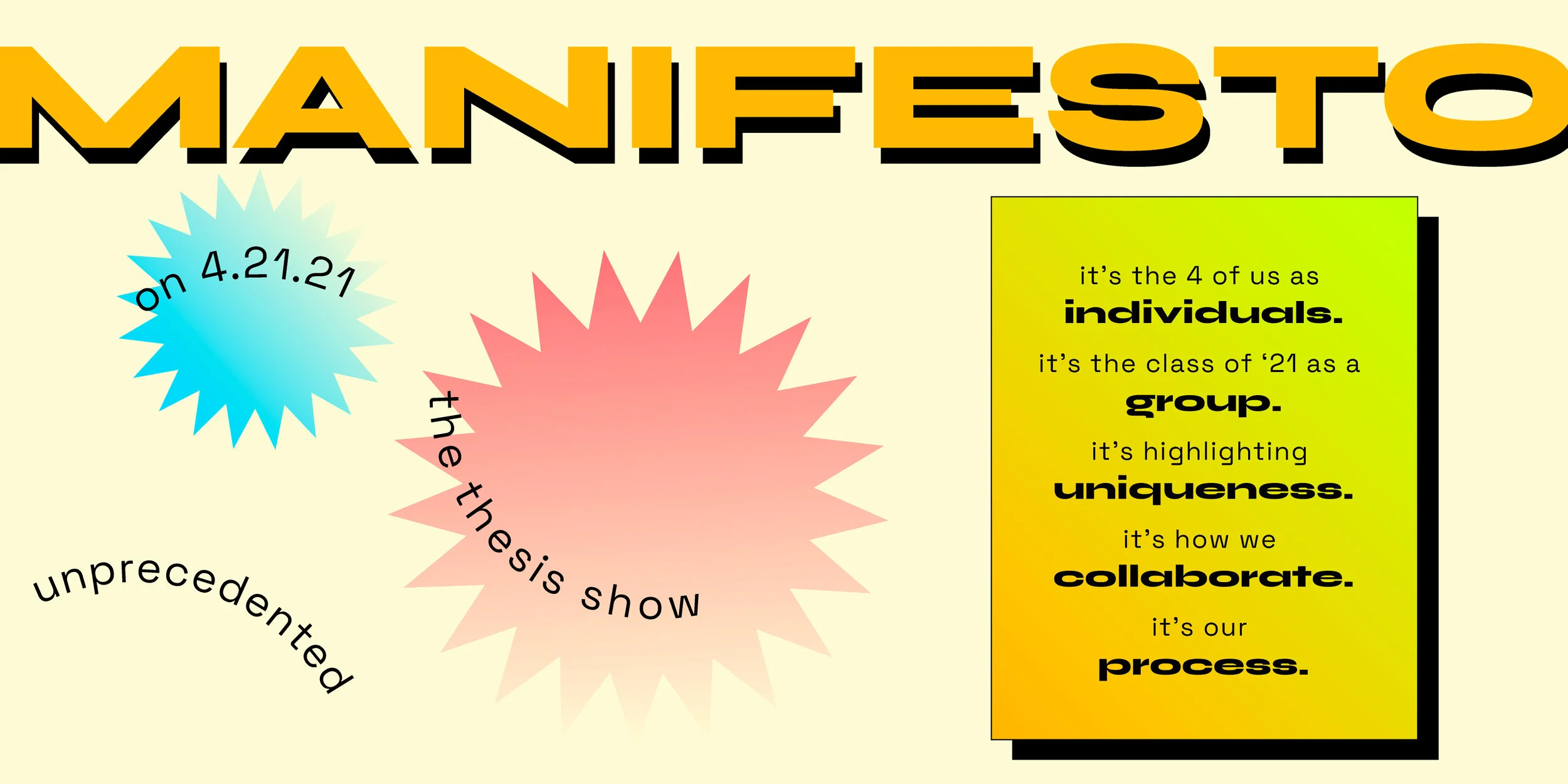
Process Theme ⇒ Each of us were interested in process of design; we’ve spent hours talking about it with one another and sharing our sketches, iterations, and techniques with one another. We wanted to showcase our process in this exhibition.
Variety Show Theme ⇒ Because these times and grad school were so stressful, we wanted to keep the mood light while highlighting each of our personalities, interests, and designs. So we came up with fun ways to do that in our branding and campaign.
Deliverables
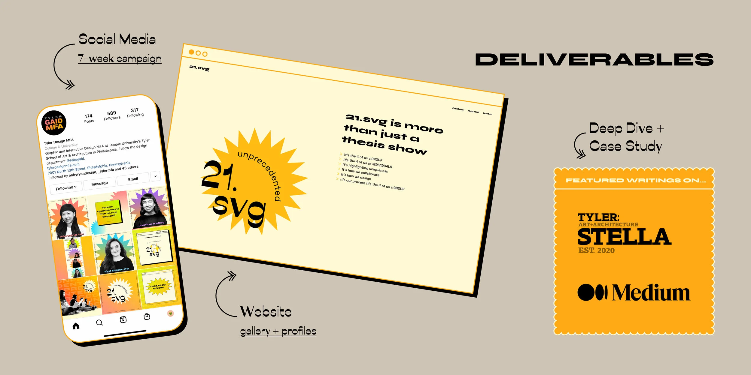
Website + Social Media ⇒ For ease of access during the pandemic, we decided it was best to forego an in-person thesis exhibition and have our work showcased on tylerdesignmfa.com/2021 and @tylerdesignmfa Instagram.
STELLA Online Gallery ⇒ We also worked with the Tyler web team to set up a mini online exhibition on the STELLA Online website. This was a way to promote our show and feature more behind-the-scenes content.
Logo
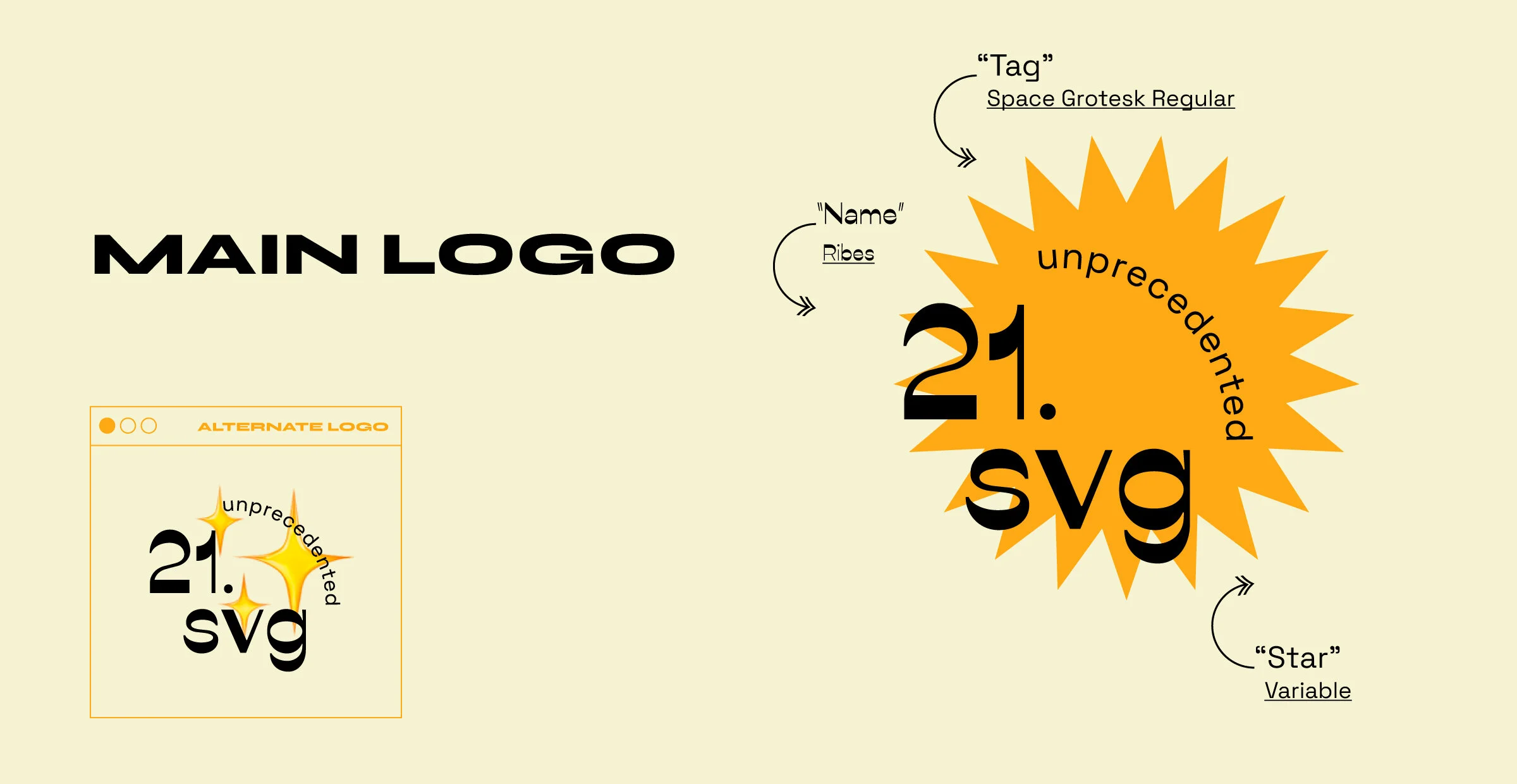
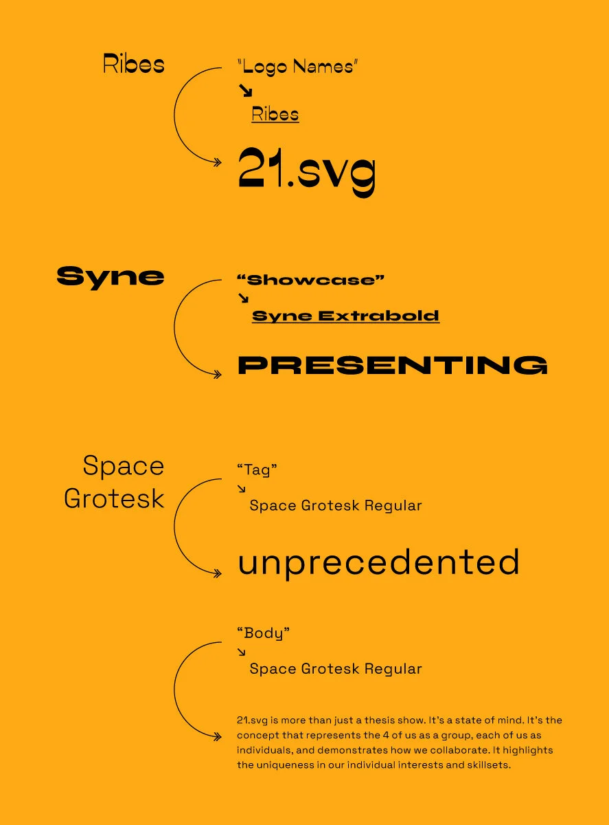
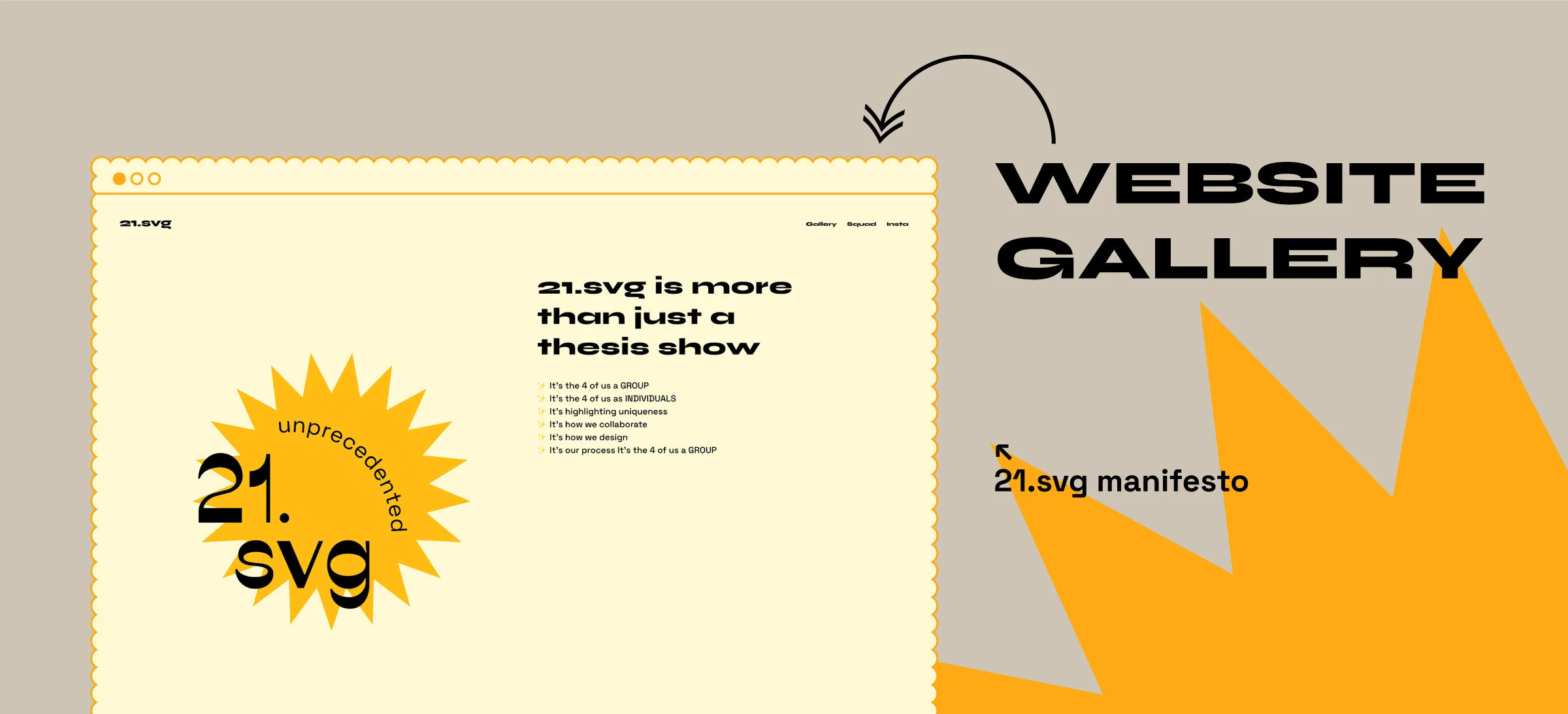
The orange burst has 21 points, and Ribes (“21.svg” typeface) was a reverse contrast typeface that felt unique enough for our brand. The arched “unprecedented” (set in Space Grotesk) encircles the negative space to highlight the form of the 21.svg logo.
Variability
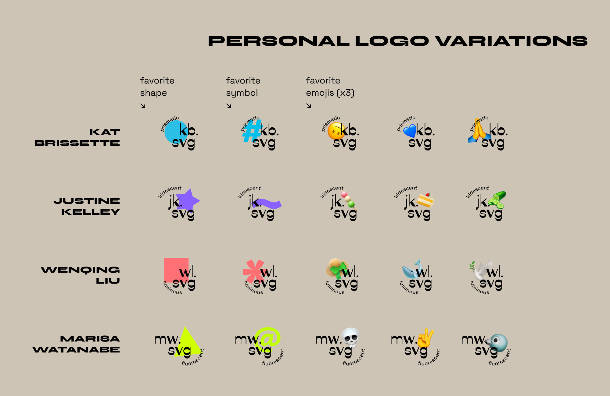
Each of us had our own set of logos, in order to harken to our individualities. We all had different favorite shapes, colors, symbols, and emojis, so why not use them? We also had our own set of “ultra-supreme” words to describe us. Each of our logo sets features our initials, .svg (file extensions pun), our tagline, our favorite color, and whatever favorite graphic.
Colors
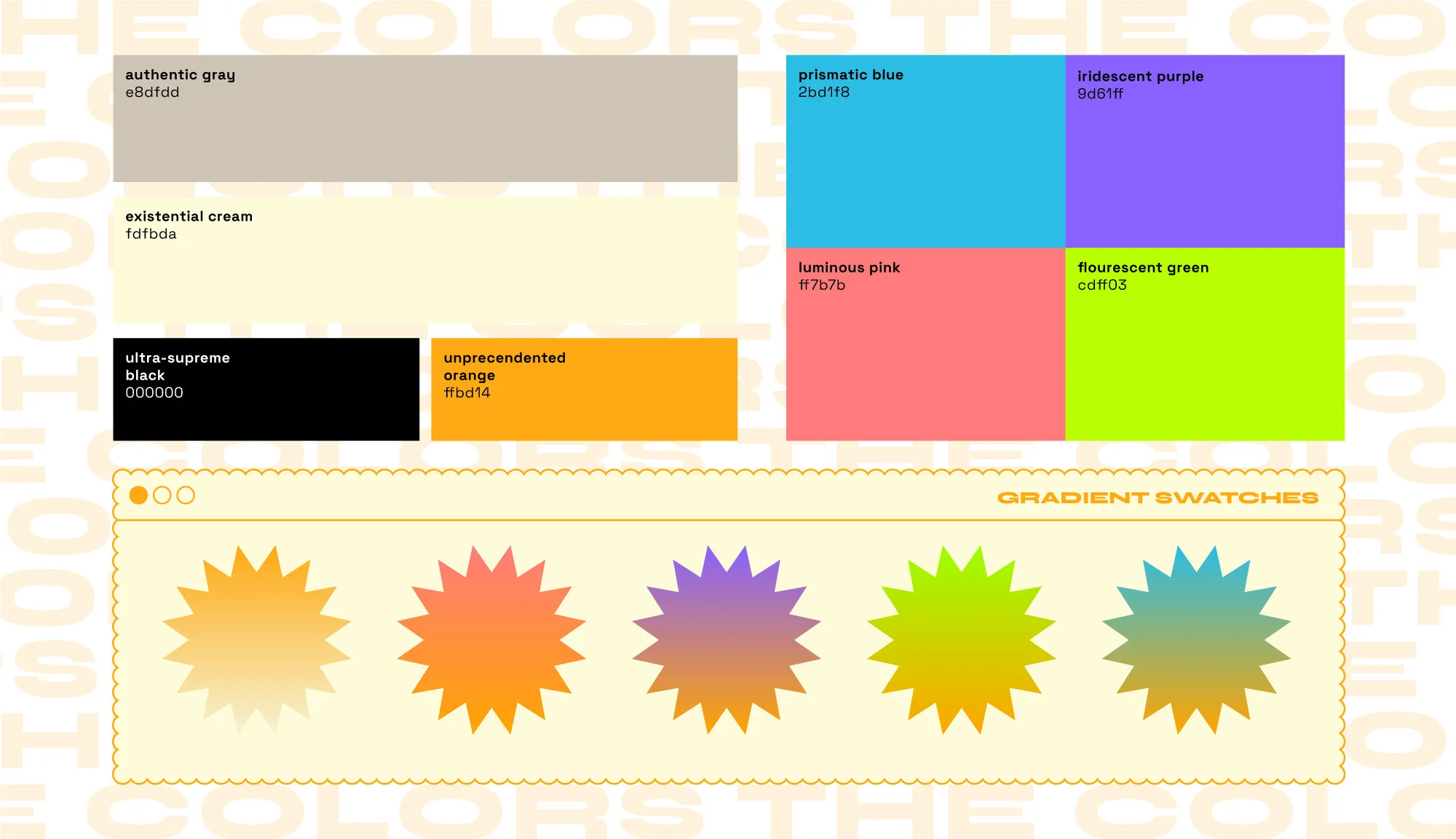
The base colors met the overarching 21.svg brand’s needs and our individual secondary bright, neon, colors were used in tandem with the base brand to break up the orange, cream and black.
Typography
The typefaces are all open-source. The ones we settled on were Ribes, Syne-ExtraBold, and Space Grotesk.
Social Media
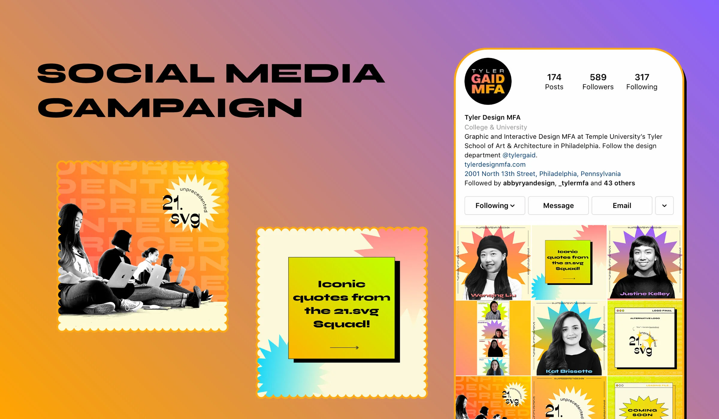
We held 7-week campaign (starting on 3/21/21) as a lead-up to our website going live and to the end of the semester (AKA graduation!) with a total of 21 posts. The campaign consisted of a series of announcement posts, process posts, and silly posts, making use of Instagram Reels, Stories, and posts. You can check it out at the @tylerdesignmfa Instagram.
Website
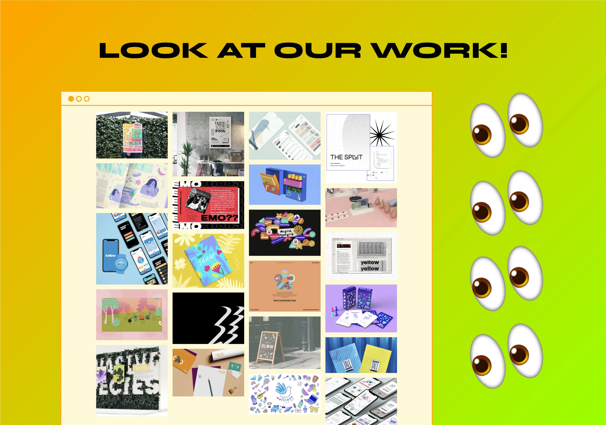
We launched the 21.svg website on 4/21/21. Our primary goal for the website was to showcase our projects. Since it was meant to be a stand-in for an in-person gallery show, we wanted to have our designs come first. This resulted in the home page being the gallery space where visitors can learn more about the project.
The Squad
21.svg culminates our personalities and designs through goofiness, funkiness, and an exclamation point. We’re all proud of what we came up with for the 21.svg show and for our portfolios. And who knows, maybe you’ll even see a 21.svg design studio pop up in a few years. 👀

