Form-Making
Design Experiments
This was a series of quick, iterative explorations that shook me out of my visual routines and comfort zone. In these experiments, I used unconventional making techniques to play with type and image. For these projects, the process was the end-deliverable, the outcome was unknown, and the main marker of success was that I surprised myself with the result.
COMPONENTS:
Image-Making
Experimental Typography
Google Slides
INSTRUCTOR:
Nathan Young
Against All Odds
Drawing on the visual and process-based discoveries I had made in previous projects, I developed these experimental typographic explorations about the song, "Against All Odds" by Phil Collins. The images use found YouTube comments and screenshots of music reviews. The comments reveal the intimacy, sincerity, and sometimes aggressive reactions of Phil's online audience to his music.
Affordances
In the above images, I exhausted the capabilities of Google Slides as an image-making tool. On the right is a composition merging the affordances of Google Slides and a calligraphy pen, integrating the message, “Our What Is A How”.
Protocols
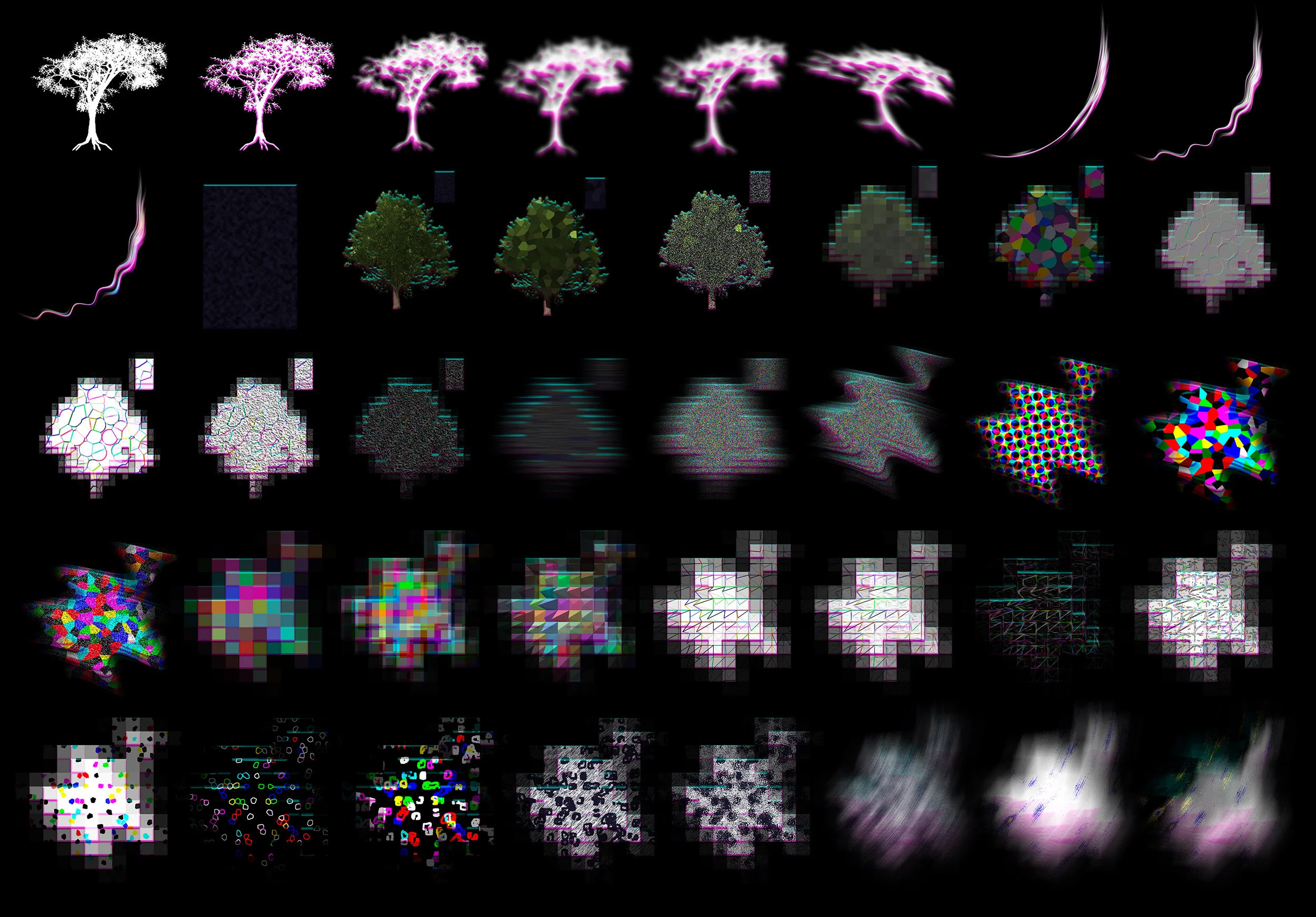
Using a systemized method, I made a series of images, repeating the exact same process to create the image. This was a pattern of Photoshop filters applied to the same tree image 64 times, resulting in surprising effects.
White Rabbit Pt. 1
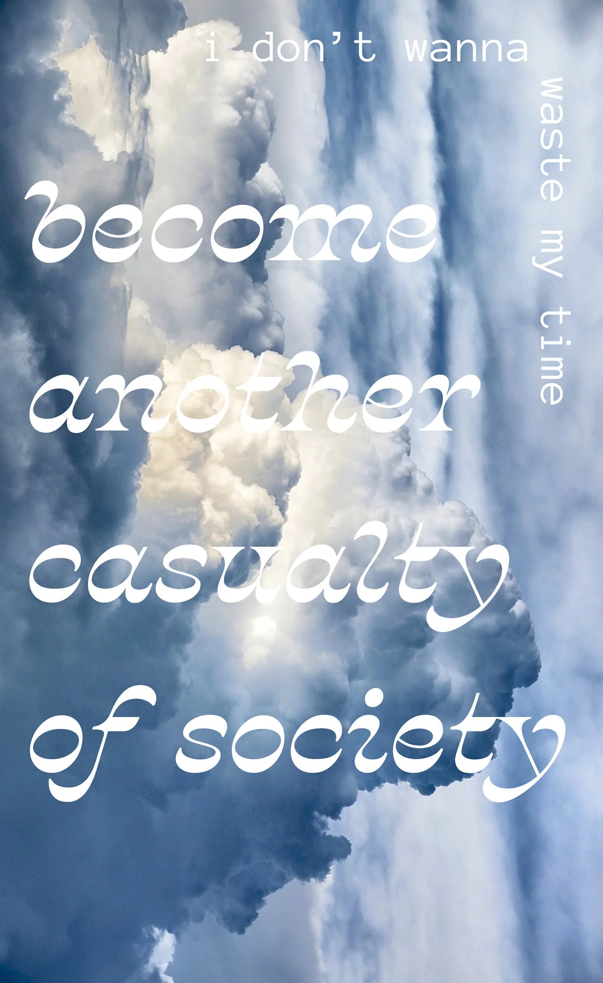
I superimposed type (lyric credit: Sum41) over a found image, and made changes to the image 10 times. The first changes were subtle, but by the halfway point, the original message was obliterated and I introduced a new typographic message. By the end, the second message was obliterated as well.
Experimental Letterforms
These two alphabets were created with the restraints of limited shapes, parameters and forms.
Remix Poster
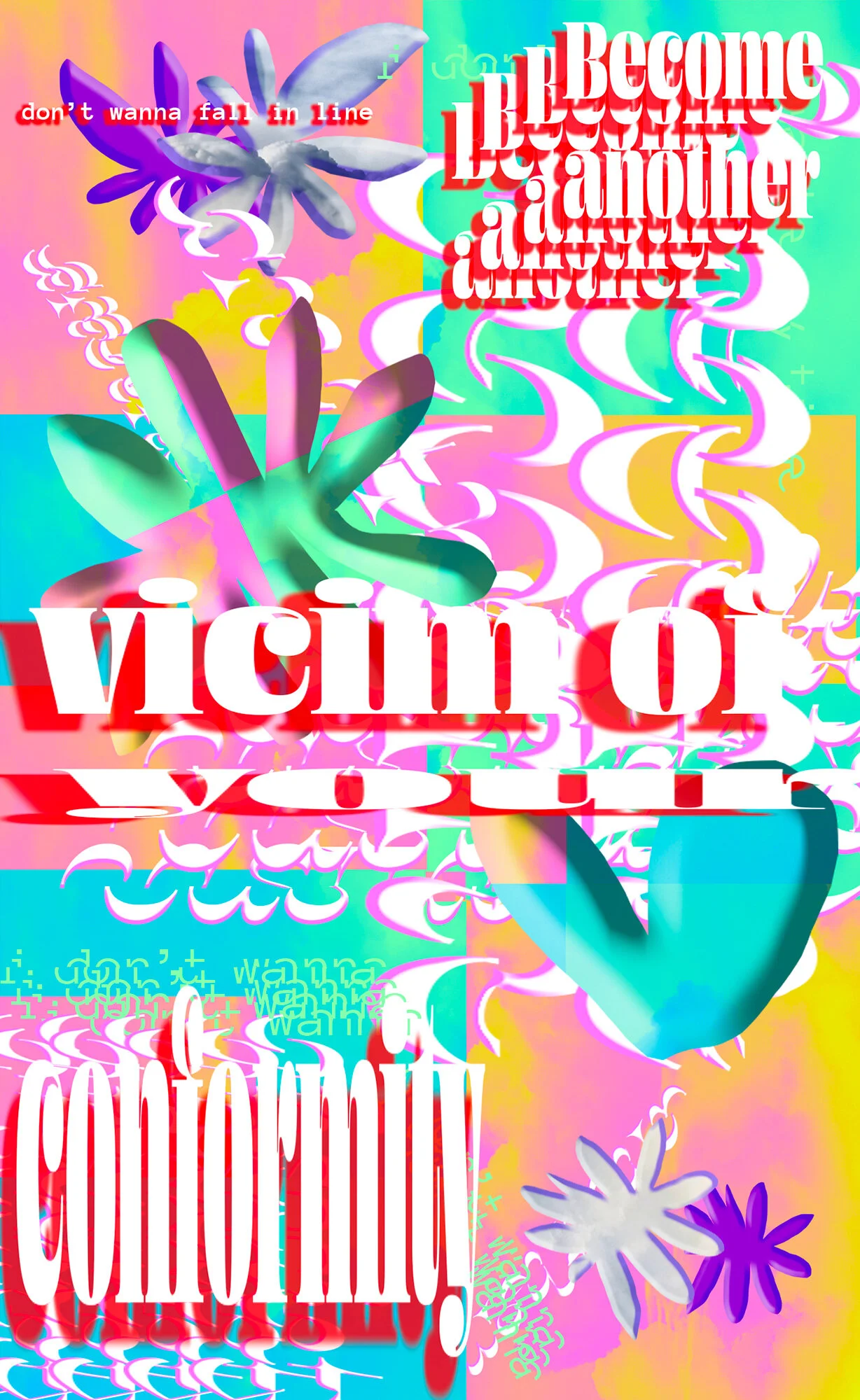
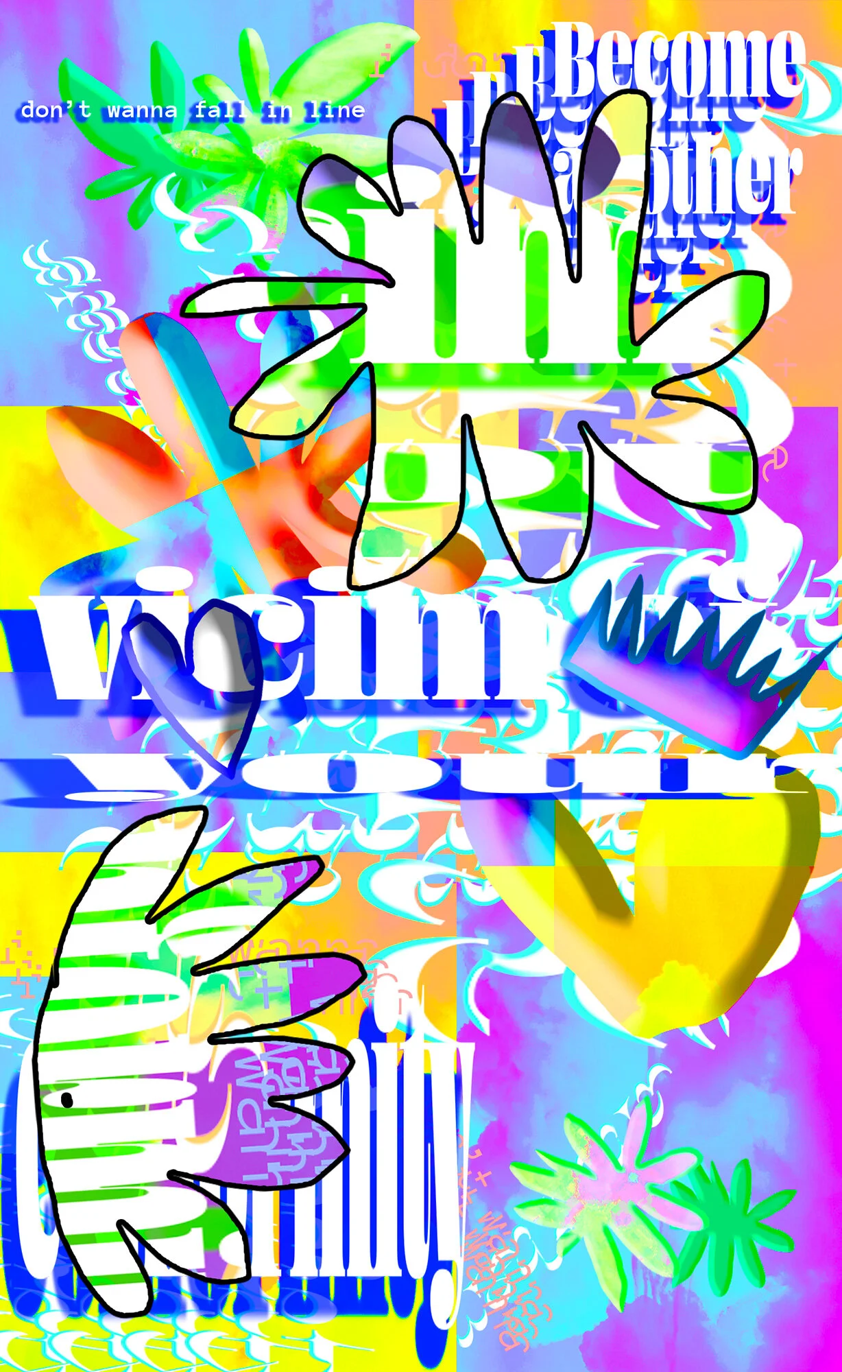
The constraints for this poster were to:
Include elements of two different vernaculars
Do something a design professor told you you must never, ever do
Include the message, “Cult of the Ugly”
Incorporate a Brian Eno Oblique Strategy
And one of Aristotle’s Alterations


